Friday, December 2, 2022

User experience should not be a joke, but it is

The difference between the plan in design for pedestrians to use a paved  path and what people do in real -- cut  corners by walking through the grass


When I planned to write this post I was just going to feature a joke. But it became slightly more complicated as a result of my search for a written account of it. 

I never expected to find it in Snopes of all things. But what's even funnier than the joke is how the post treats it. 

Some background first:  I've been reading Steve Krug's Don't Make Me Thinkwhich actually did make me think quite a lot about usability and the kind of planning and testing that has to go into design built for the user experience  (UX). 


Remember the joke about the parrot? 

I then remembered a joke about a man who sends his mother an impressive bird as a gift. She mistakes his intent and cooks it. In the bare bones account, you can see that it's a simple misunderstanding.

But the fuller version highlights the way the giver has a lot more information than the receiver that is not conveyed by the presentation alone. In other words, this is the perfect illustration of the disconnect between the designer and the intended user of the design.

I had recalled this joke as being of Jewish origin, and there are various sites that corroborate that, including stljewishlight and Aish. The latter version is the one that Snopes opens with -- though it deliberately removes the Jewish association of the joke (as the joke is very much a Jewish mother one in observing how difficult she is to please)  by saying the parrot was taught to recite the Bible in a church. 

We'll skip the cultural appropriation one and go to an older version of the joke in which the gift is for a wife rather than a mother. Snopes gives a real credit for that one to Bennett Cerf and the book Laughing Stock. New York: Grosset & Dunlap, 1945:

A certain lady who lived on Park Avenue loved birds and her husband was rich enough to indulge her every whim. For a birthday present he found her a parrot that spoke eleven languages and that cost him exactly $100 for each language. When he got home, he said, "What d'ya think of that wonderful bird I sent you?

"It was elegant," she answered. "It's in the oven right now."

The husband's face turned purple. "In the oven? he shouted. "Why, that bird could speak eleven languages."

The wife asked, "Then why didn't it say something?"

The joke's on Snopes

I love the punchline here because it demonstrates that it's not the recipient's fault that she didn't grasp the intent of the gift. She sees a bird; she thinks dinner. She does not think novelty pet, and the only way to make her think that way it to make it glaringly obvious that this is not an ordinary bird -- a failure of communication that doesn't account for user expectations.

But that's not how David Mikkelson of Snopes reads it. No, he suggests that the joke is on the ditzy wife or clueless mother, and so he misses the real point of the joke..

Other people are not in your own head, and it is your assumption that they'll know what you know and act accordingly that makes you the fool in the joke.

Baby mobile that the parents love b/c they see the animal, bu the baby only sees the bottom


Tell me that you don't about usability without saying it


In the course of reading Hangry: A Startup Journey by Mike Evans, I came across a perfect illustration of various ways in which people prove they have no clue about usability. In the seventh chapter on p. 112, he recounts the "subtle and dangerous" issues that came to his attention after he gets back from 6 weeks away from the GrubHub office: 

"I hear a software developer frustrated that users on the website can't see the obvious buttons -- as opposed to assuming the button need to be more obvious. I hear an account manager (not Todd) refer to a restauranteur as 'stupid' for not understanding the order confirmation system." 

At that point in his startup journey, Evans had already learned that you need to see things from the customer/audience/user point of view if you are to succeed in business. Their lack of understanding reflects more on your failure to incorporate an empathetic perspective into your design than their lack of intelligence. 

Maybe the visitor just wants a bird for dinner, and you're assuming she will be automatically understand you're offering her a unique pet. Or maybe you're seeing the cut animals from above, but the users view is in the position of the baby from below.

Wednesday, November 30, 2022

Harder than pulling teeth: dealing with a foolish consistency

Photo by cottonbro studio: https://www.pexels.com/photo/an-x-ray-image-of-a-jawbone-in-the-computer-6502014/


A dentist practice is the setting of this story, so the title reference is particularly apt. The foolish consistency reference alludes to Emerson's observation, "A foolish consistency is the hobgoblin of little minds." 

When that kind of foolish consistency translates into a blanket policy, the hobgoblin hobbles progress and finding better solutions to problems. It took my considerable persistence to point out the WHY of the policy in place and offer a solution that was better all around than blind adherence to the blanket policy.

One troublesome tooth was the cause of multiple dental visits this year and procedure that you likely don't want to hear about. I have dental insurance, but there is always a copay due for any work done, and the dental office likes to collect on the spot based on what its own estimation.

I don't mind that and do offer my HSA card to cover the charge. The problem arise when the office's estimations proves to be a bit off. 

If insurance paid less than it had anticipated or somehow adjusts the numbers in some way, the office then mails a bill for that difference -- and it's been as little as $3. For this particular visit, it amounted to $9.30, and there's the rub.

The office has adopted the policy not accepting any form of card payment -- including the HSA one -- for any amount under $25.So what happens when the patient share of the cost tops $25 but the dentist staff insists on your paying an estimate that opens up the possibility of a balance due under $25? 

Then the patient is deprived of using the HSA of FSA funds earmarked specifically for this purpose because the office won't accept the card payment. I had previously handed over the cash for a $3 balance and was even prepared to pay cash for this balance, but the office itself messed that up.

After I got the bill for $9.30 in the mail, I told my husband to take care of it when he had his checkup. He offered a $10 bill, but that didn't fix things because the office had no change. The woman who should have taken the money then told him to just hold off.

So that is where we were a few weeks later when a second bill came in the mail. Has it started to dawn  on you that the dentist office had already shelled out $1.20 in postage to mail out the bill twice? 

Blanket policies intended to save money actually end up costing more


That amount is substantially higher than the loss the practice tries to avert from its blanket policy, as the dentist confirmed.  The card processing costs  5%.  For a payment of $9.30, the loss to a fee is less than 50 cents. 

 In other words, the fees on these small balances typically amount to less than the cost of a stamp. But the office will automatically mail out a bill every month to try to recoup the $9.30 while absolutely insisting that it cannot take a card payment, though that would have eliminated the need and cost of the mailed invoice. 

The foolish consistency that defines the dentist's  blanket policy leads to an irrational approach that exemplifies false economy:


Irrational as that is, I did not begrudge my dentist's avoidance of loss due to fees. I told that woman in the office that I will cover the fee. She can just add it on to the amount due on my card. That way, I get to use my HSA funds as they were intended, and they don't lose out. 

She would not be budged, repeating the policy line for the fifth time. Finally, the dentist finished what he was doing and came out. He reiterated the policy, but he was willing to accept my offer to cover the fee. 

What I find particularly funny in all this is that while the dentist stood by adhering to a policy, he questioned why my husband had not just left the $10 without getting 70 cents  change.  Well, the reason is because the office person got flustered when she didn't have change and told him to just leave it.

But it's pretty astounding that someone who will inconvenience his customers and now allow them to use their HSA cards for payments to save that 5% on small amounts things that payers should not give a second thought to overpaying by 7% -- even if they can have  it "on account." Don't forget to apply my 70 cent credit!" 

A couple of weeks later

A couple of weeks after I posted this, I was reading Don Norman's The Design of Everyday Things  and learned that there is a term for exactly what blanket policies thwart: a root cause analysis intended to solve the actual problem. 

  Sakichi Toyoda, whose name morphed into that on the motor company brand, called it the 5 Whys. He posited that when something goes wrong, the first why is rarely the root cause, and you have to dig back through 5 layers to get to the first cause of the problem. 

The idea that there is a whole chain of causation to outcomes is famously encapsulated in an account of how a nail caused the kingdom to be lost: 

For want of a nail the shoe was lost.
For want of a shoe the horse was lost.
For want of a horse the rider was lost.
For want of a rider the battle was lost.
For want of a battle the kingdom was lost.
And all for the want of a horseshoe nail.


If you stop after just one or two whys here, you wouldn't trace the loss of the rider al the way back to the loss of the shoe due to the want of a nail. 

In the instance of the dentist policy, it didn't even take that many layers of questioning -- just one Why, as I did. But I first had to stand my ground with great tenacity in the face of the repetition about the policy. 


Monday, September 5, 2022

French vs. American Style: the du Pont Estates in Delaware

Nemours dining room, photo by Charles Brown

                
                 Delaware is home to two famous du Pont estates that reflect the distinctive aesthetics of their owners. In 1907, Alfred I du Pont built an 18th-century style chateau on 3,000 acres hat he named Nemours for the French town of his great-great grandfather. Winterthur, on the other hand, evolved from a 12 room house buit in 1841 to a 175-room mansion that Henry Francis du Pont intended to house his collection of American antiques and to serve as museum and resource for American style.

On the American side

This rivalry between French and American style is one of the  themes of the exhibit currently on view at the Winterthur Museum: Jacqueline Kennedy and H. F. du Pont: From Winterthur to the White House. When Jacquelin Kennedy undertook a project to restore the White House to the glory it lacked at the time, she enlisted the help of the H.F. du Pont. He steered her toward American style over French -- the style she had personally preferred


He also steered her toward authenticity even at greater experience. The strongest example of that was his advice to spend $12,500 to obtain the actual Zuber wallpaper for the White House Reception Room rather than to commission a copy for a fraction of the cost. Incidentally, the man who sold the committee the wallpaper --Peter Hill -- had purchased it for a mere $50, though he had to take it down himself  before the house in Maryland that had it on the walls was demolished.

Winterthur
Winterthur, photo by Ariella Brown


Winterthur house back view
View of the back of the house from the Reflecting Pool area, photo by Ariella Brown

H.F. du Pont had a great passion for American artifacts, history, and gardening. The Winterthur Museum and Garden (there's also a library, though it was closed to the public when I visited) are all a testament to that. For the cost of general admission of $22, you'd gain a two-day pass that entitles you to museum admission (not in the house itself) with the option for a tour, a house tour (where you only get to see about a dozen out of the 175 rooms) and garden tour that covers a small part of the 60 acres of gardens plus as much walking around the 1,000 acres of the estate as you're up for. 


Most of the ceilings at Winterthur have a perforated coverto allow electricity to get through. I have to say that I find it really detracts from the effect of the rooms so carefully set up to reflect a set period.


      Half of one of the symmetrical rooms in Winterthur, photo by Ariella Brown


                                View on the estate, photo by Ariella Brown

Spring seems to be the ideal season to come to see the millions (yes, that many) of bulbs come into bloom that change over the colors you'll see no less than three time in the space of a month, according to our guide. Another garden highlight are the thousands of azalea bushes that would be at their peak in April and May. But no matter what time of year you visit, you can delight in the Enchanted Woods See photos below:


Frog fountain in Enchanted Woodsm Winterthur Gardens


   Child's playhouse with thatched roof, furnished table, benches, chairs, and a working fireplace in the Enchanted Woods  

You can also indulge your whimsical side at Winterthur by stopping in to see  the Campbell Collection of Soup Tureens right next to the museum building. The designs to range form the subline to the ridiculous with some that would look like what you might find in your grandmother's collection, while others would make you wonder: "What were they thinking?"


                                  3 soup tureens from the Campbell Collection, photo by Ariella Brown


                             What else would you serve turtle soup in but a silver tureen shaped like a turtle?


                 .
On the French side

While Nemours doesn't boast a museum or the particular delights of a child's garden, the architecture of the house and the view of the splendidly appointed rooms, plus the exquisite layout of the formal gardens adorned by fountains that all seemed to work (unlike the ones in Kykuit) and a collection of gnomes beyond the standard bearded men, scattered around the place are  well-worth the cost of $20 for the day-pass  for access to the house and grounds. Both estates offer shuttles to carry you from one point of interest to another if you tire of walking. 

Nemours Manion
Nemours Estate: all Nemours photos here by Charles Brown


Nemour droom


                                                   Nemours conservatory


Four things you get to see in Nemours that are  not on public view at Winterthur: bedrooms, a bathroom made for the house, a laundry building, and a garage with beautiful  vintage cars..


                                       Laundry required using a washboard in large sinks


As you may have observed, I was able to post a lot of pictures here. That's because there are absolutely no restrictions on photography in these du Pont estates -- only a bar on using flash indoors. In contrast, Kykuit prohibits any photography inside -- even in the garage that houses the cars. It also does not allow visitors to roam the grounds freely at their own pace. Consequently, I would say that the Delaware estates are both a better value and friendlier as attractions. Just they are quite a distance to travel from New York. 


Thursday, August 25, 2022

Discovering Buckminster Fuller on Long Island

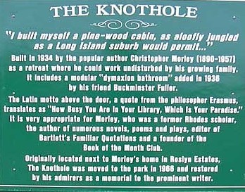
While I may have heard of Buckminster (more commonly known as Bucky) Fuller in the distant past, what made me grow curious about him was a visit to a Long Island park named for his friend, the author, Christopher Morley. There are far larger and more impressive parks on Long Island, but the distinction this one has is that Morley's Knothole -- a small house in his yard he would escape to to write in peace and quiet -- has been relocated on the park grounds. 


Christopher Morley Park sign for the Knothole


Failing to find the bathroom in the park
While anyone may build a shed of sorts in which to escape the hubbub at home, they are not likely to have it equipped with a Dymaxion bathroom. But as Morley was a close friend of the man who dreamt up the design, he got on for his Knothole. Curiosity about that drove me to visit the park to see this marvel of easy-cleaning engineering that dates back to 1936. Alas, you cannot see anything inside the Knothole, which is kept closed and is falling into a sad state of disrepair.

What it should have looked like is this:
source https://slideplayer.com/slide/4283236/

The bathroom would have been made out of metal in a very compact and efficient design that was meant to be very easy to clean. Fuller did plan to one day render it in plastic for greater comfort, but the ones he did get made were metal.  The bathroom was supposed to be just one component of the highly efficient Dymaxion house that he was hoping would take off but never did. 

Even Morley's Knothole follows very traditional-looking architecture with nothing that would make you expect it houses a revolutionary design. In contrast, the full Dymaxion home was meant to be modern all around, and I do mean round. See the vintage video that showcases it here: 


Reading Fuller

With my curiosity piqued, I checked out several Bucky Fuller biographies from my library last year. But despite being a pretty fast and determined reader, I couldn't make it through them. But in August, my library got in a new bio, and this one I was able to read within the allotted two weeks for new books. It's Inventor of the Future: The Visionary Life of Buckminster Fuller

If I were to give it a star rating, I'd probably give it 4/5. It's highly readable despite the geometric details entailed in describing Fuller's concepts and their applications that endure beyond his own lifetime (like the carbon formation that resembles a soccer ball that was named Buckminsterfullerene AKA Buckyballs in his honor).

However, I don't fully buy into the parallels that Nevala-Lee attempts to draw with modern day influential figures and Fuller. Not all people who may be described as visionary or innovative operate in the same way. Certainly, Fuller was never was a major commercial success and really did not have good business sense at all. 

This account of Fuller may upset some people. Other descriptions of him focused on his creativity and presented him as a kind of magnanimous leader. But the take on his personality here is much darker. There are several account of fallouts with people who felt they were shortchanged on credit for concepts or who were cut out of Fuller's organization because he refused to cede control.

Worse than that are the glimpses into his more private life that shatter the romantic story of his marriage. He remained married for over 60 years and was not even parted from his wife in death.They shared a funeral and a grave. Yet he cheated on her repeatedly -- sometimes with women young enough to be his daughter or just barely of legal age. It seems he bought into a kind of myth he created of himself and associated these women with muse-like figures, linking them to particular discoveries, as he wrote in a certain account himself. But the marriage itself reflects some of the Long Island connections that the book brought to light.

Fuller and  Long Island History
What struck me in particular is that Fuller was married at Rock Hall, a colonial house that has been a museum since the middle of the 20th century. But in the early part of that century, it was still being
used as a home by the Hewlett family. Fuller's wife, Anne, was a Hewlett, and her wedding took place in that house. The Fullers even lived in Lawrence for some time and attended a church in Far Rockaway.* As someone who grew up in that area and who has visited Rock Hall a few times, I found it striking that such a famous person had such a strong connection to the place is not featured at the museum at all. 
Fire Island lighthouse: photo by Ariella Brown


But there is yet another location on Long Island that is connected to the Fuller name. That is his great-aunt, Margaret Fuller. If you visit the Fire Island Lighthouse  -- or its site -- you can find an account of the shipwreck that proved fatal to her and her young son when she was returning to the United States from abroad 

Nevala-Lee does make much of the Margaret-Bucky connection, as they both had a strong sense of purpose and conviction that they were particularly endowed with abilities to use to guide the world. Bucky even took a nautical image to express that -- not of a lighthouse but of the small end on a ship's rudder that can determine its direction -- the trim tab. In fact that is what he had inscribed on his gravestone pictured below:
Bucminster and Anne Fuller's grave
    
                                   https://commons.wikimedia.org/wiki/File:Bucky_TRIMTAB.jpg

*One thing the author does get wrong is the name of the hospital in Far Rockaway. He mentions that Anne went to St. Joseph's in Far Rockaway, but the name of the hospital is St. John's. It's still there.

Related:
How many times did Edison fail in attempting to invent the light bulb?


Monday, August 22, 2022

Art, Architecture, or Parkland: Contrasting Estates of the Rockefellers


Sculpture-topped fountain at Kykuit. Photo by Ariella Brown (all rights reserved)


If you decide to explore some of  New York's historic Hudson Valley, you can see a study in contrasts between two Rockefeller estates: William Rockefeller's Rockwood Hall in Tarrytown and John D. Rockefeller's Kykuit in Sleepy Hollow. 

Now you see it, now you don't

The first obvious difference is that you can drive right over to the site of  Rockwood Hall and walk about it freely, as it is now a public public park. You cannot just drop in to see Kykuit. You have to first stop at the the Viistor Center at Phillipsburg Manor to meet for the tour there -- even if you have purchased your ticket online to save $2 . (You cannot tour the Phillipsburg Manor freely either, so if you want to work out that tour, budget both the time and the cost to do so on your visit). 

(Below is a picture of the grist mill at Phillipsburg Manor that I took in August 2022. I was on the tour years of the property several years ago. I'd say it's worth doing once but not necessarily doing twice.)

Grist mill at Phillipsburg Manor

Aside from the cost of free vs. $20, $40, or $60 (depending on whether you go for 90 minutes, 2.25 hours or a full 3 hour tour) to see Kykuit, the most striking difference between the two is that in one you get to see a house, and in the other the house is gone. Below is all that remains of the 204 room Gilded Age tour de force built in "castellated Elizabethan style," which was demolished in 1941.  Alas, no Escape to the Chateau style revival is possible. (The fact that the estate was designed to be self-sustaining with all the food grown and/or bred on it to serve the family, servants and guests reminded me of the Strawbridges'  ambition to use the Chateau's property in the same way).  


These structures pictured above  were not part of the building itself but a front area for tennis, etc. It does give off quite an Ozymandias vibe when you know the history of the house. In fact, the hiking tour that is offered for this -- a mere $4.02  expenditure with EventBrite's fee -- offers visitors a sticker with a picture of the house that is conspicuously absent shown below:
                    
William Rockefeller was not the first one to scope out that site for an impressive mansion. There was already one there when purchased the property. But as he expanded his holding to a full thousand acres and hired Frederick Law Olmsted -- famous for the design of both Central Park and Prospect Park -- , to design the landscape, he also expanded the house. It's not clear if he tore down the existing structure or added to it. You can read more about that and see some (not color)  photographs of the interior decorated in the "more is more" style that defined the Gilded Age here:


Crazy Rich Baptists


While William went for the over-the-top look of a castle, his brother John settled for a mere 40 rooms in his mansion that didn't even boast a ballroom. The largest room in the house is the music room, which was used for playing the organ and piano but not for dancing. Nor was alcohol served under John's domain because he was devout Baptist. However, that level of observance didn't last too long, and his son met his wife at a dance (according to the account of our tour guide) and also invested in wine glasses. on display in the butler's pantry when he gained control of the house. 

If you zoom in on the picture below, you can notice a great deal of detail on the front of the house -- from the eagle on top to the carvings below -- including representation of the arts and agriculture around the center windows. but aside from the art of the architecture, the house is home to many pieces of art --placed in various rooms, set out in the art gallery below the first floor, and scattered throughout the extensive and meticulously manicured grounds.  


The Oceanus fountain holds a prominent place in the front of the property. It is a copy of the fountain that Giovanni Bologna designed for the Pitti Palace at the Boboli Gardens in Florence.


There is a great deal of detail on the architectural structures that warrants noting -- like a slogan appearing on top of a gate, or the year building began  on top of one and the year it concluded on another. Below is a close -up of some of the ironwork that shows lifelike grape appearing among the vines:


There are many fountains around the grounds, but not all of them were on, as you can see from what's pictured above. Even the fountain that was the parallel one to the one in front of the front entrance shown below wasn't on. 

Kykuit: The gate shown here notes the year of construction. the one opposite it notes the year of completion.


Below is one of the many outdoor sculptures. The one below is by  Karl Bitter.


            This is the back part of the house with a wide porch that offers wonderful views of the Hudson


The picture above is one I took on a tour several years ago, though it was also in August. We saw more of the grounds on that tour and I took this picture of the view, sculpture and space that also frames garden views. 

On this visit, we got to see the inside of the garage with a vast collection of carriages for horses and a section of the automobiles that were used by the succeeding generations of people who lived in the house, ranging from a Ford Model S (earlier than T) to cars made in the 60s. Many of them still retained inspection stickers form 1981-1984, indicating they were still used about a decade before the house was turned over to the National Trust for Historic Preservation in 1992. 

Use it or lose it
And that is really why this house remained standing. It was occupied and used as a home for several generations and then turned over to a trust to be preserved a historic home that also functions as an museum. In contrast, the vast castle that William built was not kept as a family home, and so it became a white elephant of a property turned to use as a country club but not a residence. When that use failed, the lack of maintenance caused the crumbling property to become a potential hazard, which is what prompted the 20th Century heir of Rock Hall to demolish it and supposedly throw its parts into the Hudson. 

Related: 

Monday, August 15, 2022

The Llama of the Lake

Floating llama
On Sunday, I rented a paddle boat to venture out in Meadow Lake at Flushing Meadows Corona Park. I espied in the distance a creature sticking out of the water and paddled toward it to get a closer view.  As it came into focus, it became clear that it was an inflated llama. 

What is not clear is why it was placed in this body of water where swimming is prohibited and why there is a canister put in in its center. If any of you should know the answer, I'd love to hear it.

Should you be in the Flushing area of Queens, you can visit Meadow Lake in person, though the llama may not be visible from the shore. Measuring 95 acres, Meadow Lake's claim to fame is the distinction of being "the largest fishable freshwater body in New York City," as per New York State's Department of Environmental Conservation (DEC).

The aquatic life that confer the fishable status on the lake  include: Alewife, American eel, bluegill, brown bullhead, common carp, goldfish, gizzard shad, silverside, largemouth bass, mummichog, Northern snakehead, pumpkinseed, white mullet and white perch  The DEC mentions all of the above, though it fails to mention inflatable plastic llamas.

I do have to give a shout-out to Wheel Fun Rentals, which supplied our boat for $30 plus tax per hour. We did get there before noon when the park was nearly empty and the lake completely so, so were able to use the coupon you can find  on the link. However, it takes great stamina to keep going for more than 90 minutes and we did not use up the full second hour you get free with the coupon. 

The shout-out is for calling me to let me know I forgot to pick up my license that is held while you take the boat. As there is no official procedure for the return, I forgot about it. But I did get it back after they called me to let me know.

If exertion is not your thing, you can choose to do what this visitor did and bring your own swing seat to attach to a shady tree to give yourself the best seat outside the house.

Swing on tree in Flush Meadows Corona Park

Related post:

Going for the brass ring


Tuesday, March 8, 2022

On Valor and Virtue


If you're not familiar with Chiune Sugihara, the Japanese  diplomat posted in Lithuania during World War II who saved 6,000 lives by issuing visas to Jews, you can learn about him and find references to look up here: ushmm.org/collections/bibliography/chiune-sugihara.

For the sake of this post, I'd just like to quote what he said about his own heroism in reply to the question the author of Pepper, Silk & Ivory: Amazing Stories about Jews and the Far East (p. 189) asked about it:
"Everyone in life as an opportunity to do a good deed. Do it and leave it alone. Don't write about it or publicize it; don't make money from it. Just do what's right because it's right."


The book also recounts that he had no way of knowing at the time if the visas would accomplish his aim of saving lives. Sugihara's son Hiroki reported that when his father found out how successful his rescue efforts proved, he said, "This is the happiest day of my life."